Introduction
The Problem
"I wish I had a lot more guidance. I don't realistically know if my ideas of what is healthiest is what is best for me."
-Nick, 26
-Nick, 26
A staggering 79% of Americans are dissatisfied with their body image, and nearly half, 49%, express discontentment with their overall healthcare. Consequently, the conventional advice of "consult your doctor" fails to resonate with a significant portion of the population. People yearn for alternative avenues to discover health and lifestyle changes that suit their unique circumstances, without feeling uncomfortable or judged. Additionally, 21% of people have also suffered from a mental health condition. Mental health directly and indirectly effect people's physical health, making good mental health an important, and often overlooked, factor in a healthy lifestyle journey. Users need a way to collect all their health and wellness data in one place because this will allow them to find solutions to live a healthier life that are specific to them and their individual needs.
Discovery
Competitive Analysis
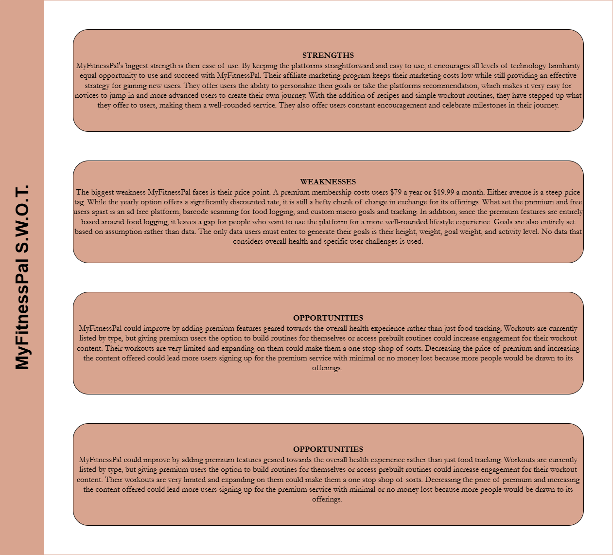
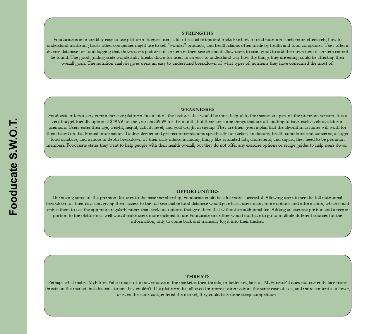
In order to fully understand the market and the problems with existing products that Health U could aim to solve. The goal was to create an experience for users that allows them to track their food intake and fitness while also allowing them to track their overall well-being and give them tools to better understand what they can do to achieve their goals and maintain a healthy lifestyle. Based on the goals, I chose to take a look at MyFitnessPal and Fooducate.


Summary
Both platforms offer users unique experiences that could help them reach their health and wellness goals in order to lead a healthier lifestyle, but the areas they lack put a huge dampener on the overall user experience and the success of the user to make healthy lifestyle changes that fit their own personal needs. MyFitnessPal comes closer to being a full-service platform for users, but it still lacks some features and customizations that would make the user experience superb and allow users to reach their end goal.
User Surveys and Interviews
Once I understood the competition, I turned to understand the user. The goal of the survey was to gather basic data about people’s most common current habits when it comes to healthy eating, exercise, and mental health. Asking these more basic questions in survey form allowed me to identify people’s baseline comfortability with their current health and wellness routines. It also allowed me to look at the data collected to identify what questions I could ask in a User Interview to dig deeper and what age ranges would be able to give me the most information in an interview. The goal of the interview was to further examine user’s responses from the survey. Using the survey as a jumping off point, I was able to craft questions that would not only give me feedback regarding what people are looking for in a mobile application for health and wellness tracking, but it also gave me insight into who I should interview to gain the most insight.
Summary
The survey uncovered that majority of people are trying to be better at eating healthy, but they do not track what they eat. Those who do track their workouts use a wide variety of methods to do so. To find recipes, the overwhelming majority of people just use google. The survey gave me a wonderfully even mix of all age groups, so it gave me better insights into what age ranges would benefit the most. The interview uncovered that most users are frustrated that they cannot find good information to help them because information they can get is so varying. Users who avoid working out do so mostly because it is hard to tell what would be good for them specifically and it is hard to find workouts that keep their brains occupied. It is difficult to get advice if you get it from a professional because you have to wait for them to be available to you and the time it takes can vary. On the other hand, it is difficult to get advice from the internet because there are so many varying sources out there. Mental health plays a huge factor in user’s ability to maintain a healthy lifestyle.
User Personas
Conception
Task Analysis and User Flows
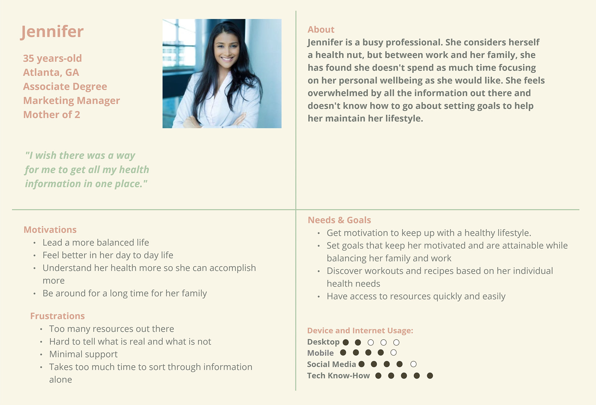
"As a working professional, I want to be able to find healthy recipes and activities all in one place so that I can spend less time planning things and more time focusing on mine and my family's health."
-Jennifer
Objective:
Create an account with Health U and find a recipe.
Create an account with Health U and find a recipe.
User Flow:
1. Open the app
2. Onboarding
3. Create an account/sign on screen
4. Navigate to the "Recipes" page
5. Meal type selection (breakfast, lunch, dinner, snack)
6. Select main protein
7. Filter by dietary needs (dairy free, gluten free, heart healthy, etc.)
8. Browse recipes
9. View recipe (view nutrition information, ingredients, time, ingredient alternatives, etc.)
10. Save recipe for later and add items to the grocery list*
*Success criteria
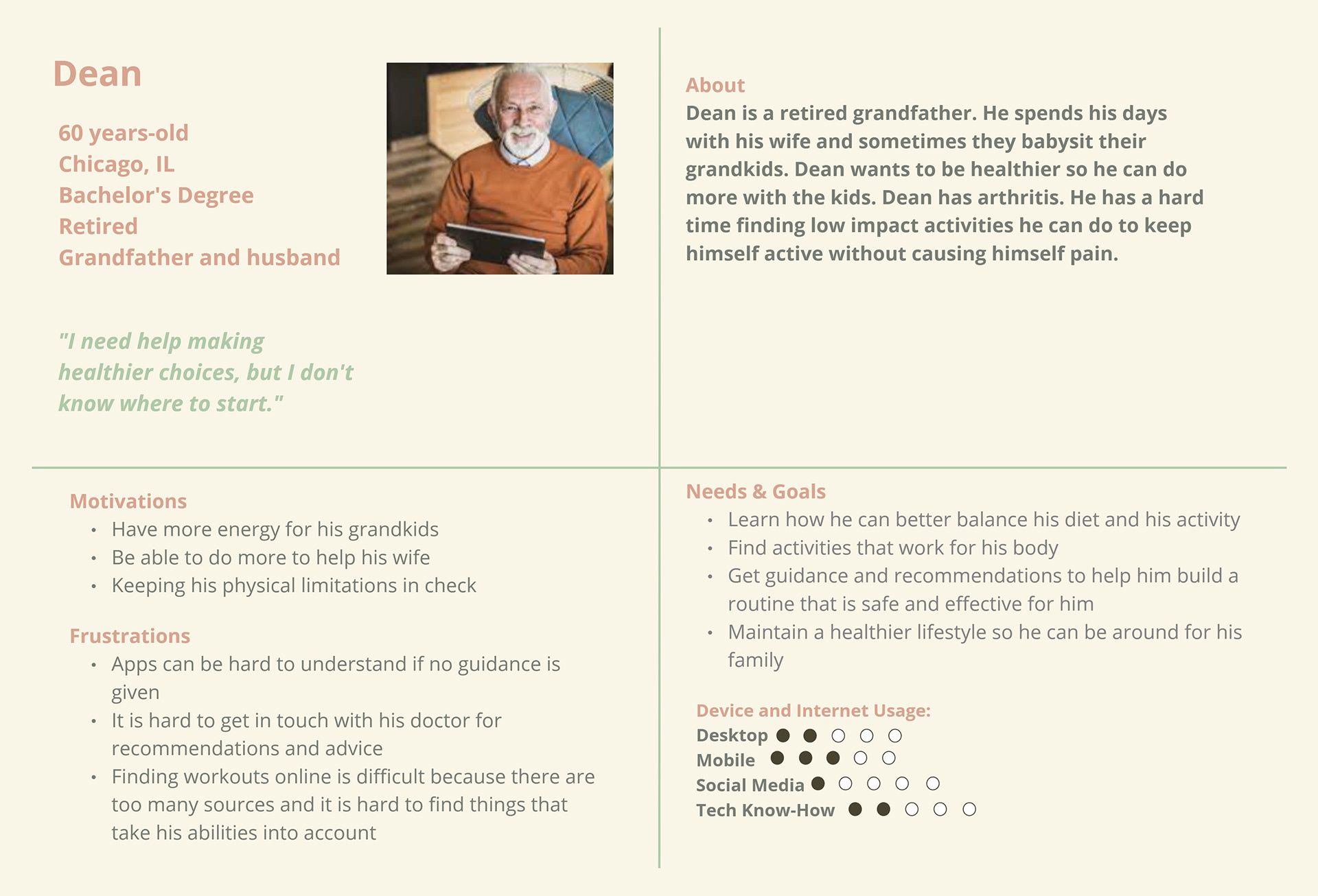
"As someone who is newer to a healthy lifestyle, I want to be able to get advice and guidance throughout my journey so that I can make sure I am making the most effective choices."
-Dean
Objective:
Log in to the app, browse content, and start a chat session with a professional
User Flow:
1. Open app
2. Sign in
3. View dashboard and navigate to workout page
4. Select recommended workouts (based on input user health data)
5. Browse recommended workouts
6. Select a workout to view details
7. Begin a chat session with a professional (chat icon will appear in all screens)
8. Select reason for chat (questions regarding if an item will be good for user, questions about moves, questions about other options, etc.)
9. Verify health data is still up to date (weight, dietary restrictions, physical limitations, etc.)
10. Connect with a professional*
*Success criteria
Wireframes
Wireframe were the first step in the physical design process for Health U. Wireframes were sketched for each task analysis created. Those sketches were then turned into low fidelity wireframes.
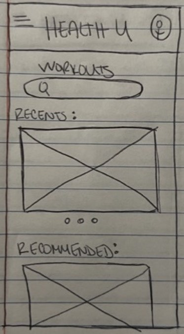
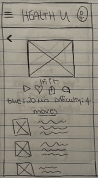
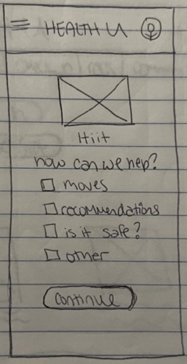
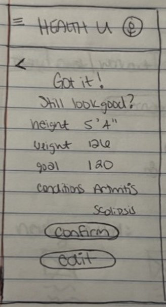
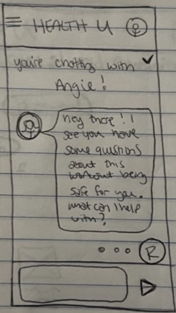
Pictured is the "Workout selection to chat" flow from Dean's task analysis.
Mid Fidelity Wireframes
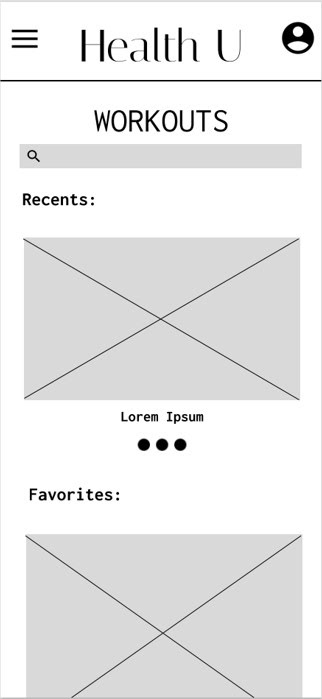
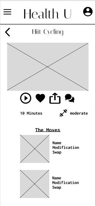
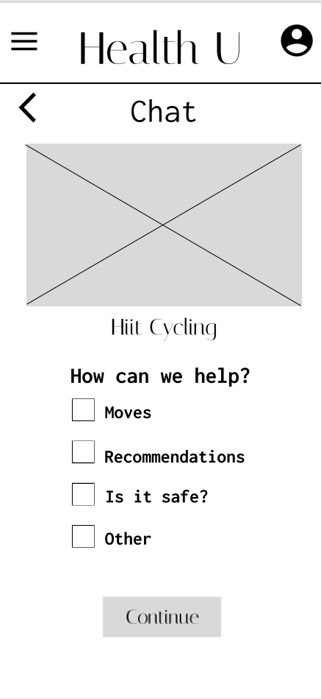
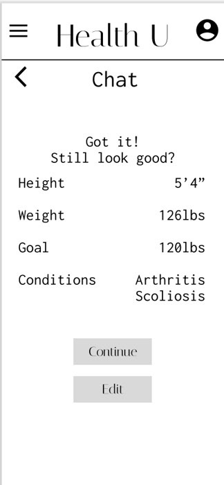
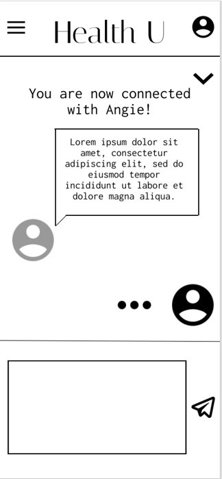
The mid fidelity wireframes were created using Figma and don't differ very much from their paper sketch counterpart.
Usability Test
The goal of this study is to determine if the design for Health U is intuitive and if potential users see the value in the information given to them in the prototype. The main goals of this app are to be easy to use and fill the gaps current platforms have, so if in this stage, potential users can’t easily navigate and can identify gaps that are not filled based on user concerns from the interview phase, more work needs to be done on the sitemap and the features.
The Test:
Users were given 2 direct tasks and 3 scenario tasks to complete using the Health U prototype.
Participants:
There were six participants in this usability test. Each participant fit the target audience and had similar characteristics to those of the personas.
Methodology:
The test was conducted with a combination of remote moderated and in-person moderated. This schedule allowed those who had spare time the chance to sit down with me to conduct the usability test, but it also gave potential users who wanted to be a part of the tests but had time constraints due to work or familial obligations the opportunity to participate.
Findings and Insights
Observations:
-Keeping the appearance clean and uncluttered is important to users
-Users had an easy time locating all the pages on their own
-Icons make it easier for all users to understand
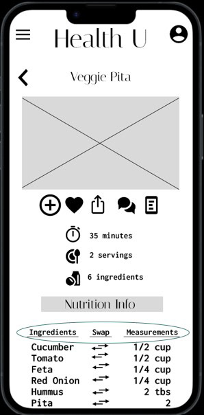
-The swap feature is great once they find it, but it needs to be labeled more clearly
Errors:
-Icons did not display properly through the entire experience for some users
-Label the swap feature better
-Add resources to help users take body measurements for the check in portion
-Add links to the nutritional analysis page so users who want to learn more about a particular topic can without having to go somewhere else to find more information
-Add nutritional information to the recipe page and ingredient nutritional comparison in the swap feature
Positive Quotes:
"The swap feature is the coolest feature I have seen in an app and it flows well."
"I love that this breaks down a grade average and a grade per item. It is easy to understand and really helpful."
"What each icon means in the onboarding is helpful and helps me learn for later."
"The chat is probably the most intuitive thing in this whole design. It is short, easy, and to the point."
"The diary is nice, clean, and straightforward, which I think works to its benefit."
"The check in on the dashboard as a little reminder always to do it is brilliant."
"The workout is really easy to navigate."
Solutions
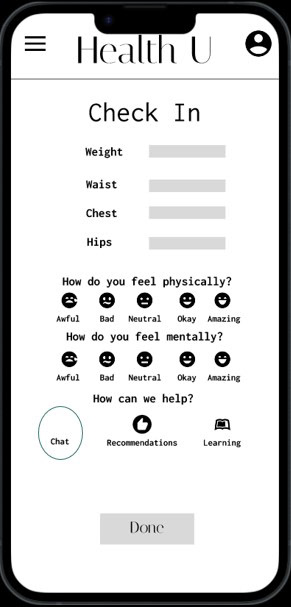
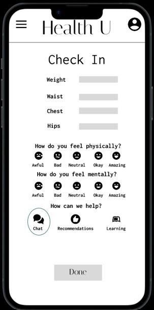
Icons not properly displaying through the entire experience.
Retest independently across various devices. Use Figma troubleshooting techniques to ensure all icons display properly. Some icons will be switched out in favor of offerings from a different plugin that were tested and did not have issues appearing on different devices to ensure future testing can be more effective.
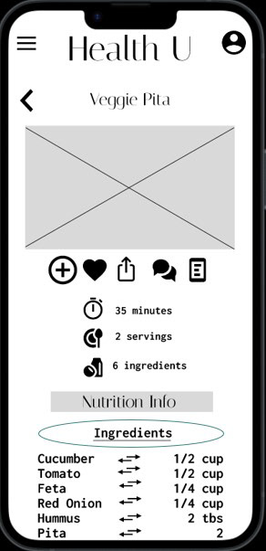
Label the "swap" feature better.
Label each column as "ingredients", "swap", and "measurements" to make it easier for users to identify where to go.
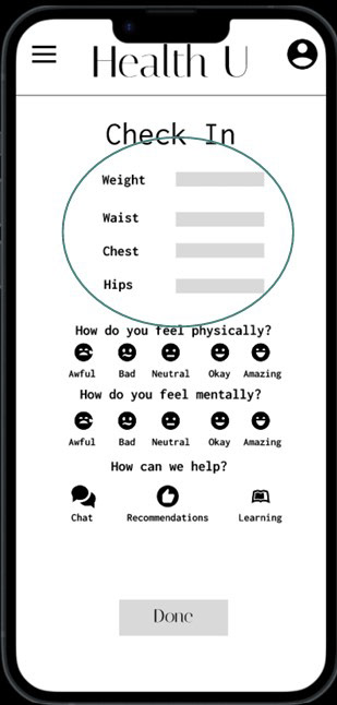
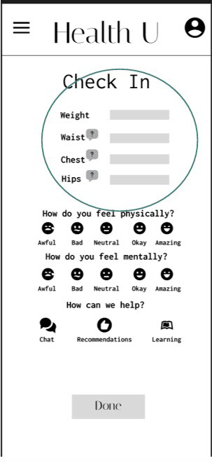

Add resources to help users measure at check in.
Add a "?" next to each measurement to give users useful tips and an explanation of how to measure to ensure they collect and enter accurate data.
Design Evolution
The screens of Health U have evolved over time. While their layouts have stayed fairly true to their original sketch counterpart, the usability and accessibility have become more evolved as time progressed. Through continuous improvement, user testing, and peer feedback, I believe I have successfully created an app that solves the original problem statement and gives users a great experience.
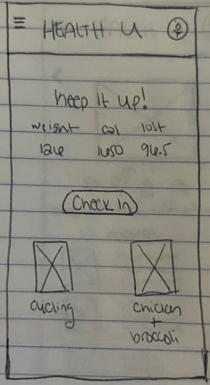
Dashboard Sketch
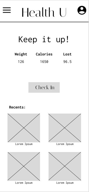
Low Fidelity Dashboard
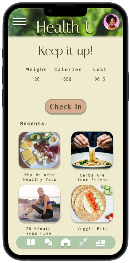
High Fidelity Dashboard
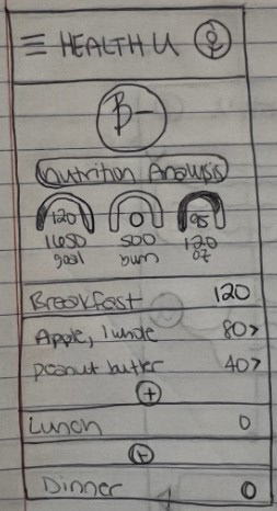
Diary Sketch
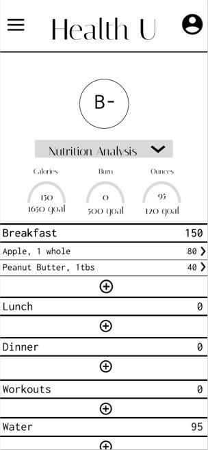
Low Fidelity Diary
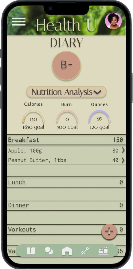
High Fidelity Diary
Next Steps
Health U will continue to be expanded on with more screens and features added. Continuous user testing will be conducted to ensure additions only add to the overall usability, not subtract from it. At least two more rounds of user testing will be conducted to ensure Health U flows well, is accessible, and continues to solve user problems. UI may be updated as time goes on based on user feedback.


