In today's fast paced world, adult learners need resources that fit into their lives. Juggling a full-time job, studying, familial obligations, and a social life isn't easy. That is where Learn comes in.
Introduction
The Problem
"I am a new mom with a full-time job and taking classes. English is my second language, and I hate that study resources are geared towards younger are groups, or that don’t consider someone’s comfortability with a language."
-Kinga, 25
-Kinga, 25
As an adult student myself, I recognize the unique challenges face by adult learners everywhere. Adult learners are expected to be able to handle the same amount of coursework as a younger person while they simultaneously balance jobs, social lives, and families of their own. Current college educational support systems are not designed with adult students in mind, which makes it difficult for adult learners to get the support they need from their learning institution. In addition, adult learners suffer more frequently from self-doubt than younger learners.
Discovery
Competitor Analysis
To better understand the gaps that could be filled in the market, I analyzed three market competitors; Vocabulary, Vocabulary Builder, and Quizlet. In this audit, I identified competitor strengths that could be implemented in the Learn app as well as competitor weaknesses and problems that Learn could solve.
Vocabulary
The Pros:
-Modern and minimalistic design
-Icon and theme selection for user customization
-Simple swipe up to view the next word
-"share", "listen", "heart", and "save' options for each word learned
-User friendly ability to write and share their own words and definitions
-Each word card gives the user the word, phonetic pronunciation, adjective, definition, and a sentence using the word.
-Users have the ability to pick their vocabulary level
The Cons:
-No search function
-Words can be saved, but it is very difficult to find them once saved
-The app offers basic Spanish words, but only gives the word and definition
-When the user adds their own word, they cannot add a phonetic spelling or a sentence
-While the user can still use the "listen" feature on words they added, it is not always accurate
Quizlet
The Pros:
-Very easy navigation
-Search function
-Simple tap for users to flip cards and reveal definitions
-Ability for users to scan text and find answers to questions
-Users can input their school and course to see what other users in the same course are studying
-Items can be saved to the user's library to retrieve and review later
-Users can create their own flashcard sets
-Four different means to study
The Cons:
-Once the user selects items they would like to learn, they can no longer browse all the subjects offered on the home page
-Users can favorite items, but there is no logical way presented for the user to view items they have favorited
VocabularyBuilder
The Pros:
-Easy to locate study topics
-Easy for users to navigate between options
-Call to Action buttons are easy to understand and locate
-Easy for users to determine if their answers were correct or incorrect
-Minimalistic home screen that allows users to make their selection without being overwhelmed with options
The Cons:
-No options for users to save words or come back to them to study later
-The experience cannot be personalized to the user's language level or study goals
-Once the user selects their initial study topic, they cannot pick any other items to work on
-Users cannot access more words until they get a certain number of words correct
-No search function
User Interviews
User interviews were conducted to identify where users themselves thought apps like these succeeded and faltered. The findings were analyzed and the data collected was used to create the framework for Learn.
The Questions
1. Tell me a bit about yourself. Are you currently a student, do you currently work, or both?
2. When was the last time you tried to learn new vocabulary? Were your motivations for business or for pleasure?
3. What were some roadblocks you ran into when studying vocabulary in the past? Were they environmental challenges, mental challenges, or something else?
4. When learning new vocabulary, what has been your favorite study method to use and why? Do you have a least favorite study method?
5. What kind of vocabulary apps have you used in the past to learn? What did you like about them? What did you dislike?
"I need something simple and straightforward to learn. The apps I have tried in the past were not memorable and felt overly complex to use. I don't have enough time in my day to learn, work, and learn how an app works if it doesn't just...make sense."
"When I was younger, it was easier to focus on learning because it was all I was doing. Recently, I have found it harder to focus and really take in all the information because I have a lot more on my plate than I did when I was 20. This learning experience has been a whole new ball game."
"I am an avid users of the dictionary app. It allows me to find synonyms so I have a better understanding of the word itself. Sometimes one word is too similar to a Polish word, so I get confused. Synonyms can be different enough from the Polish word, but similar enough to the English word that it helps alleviate my confusion."
Summary
Adult students are looking for flexibility and ease above all else. It is hard learning something new and finding options that allow them to take their physical ways of learning into the digital world so it can move with them makes a huge difference in their ability to learn and retain information. It is important to the user that they can customize their learning experience as much as possible to give them the best chance to learn and organize items based on their personal preferences and individual needs.
Meet Taylor!
The insights gained from the user interviews were analyzed and used to create Learn's persona.
Taylor needs to be able to study materials quickly and concisely. She wants an app that is designed for working professionals, not for children. She wants to be able to take her learning on the go for short, manageable, study sessions, and she needs access to as many options as possible so she can learn in her own way at her own pace.
In short, Taylor needs a learning experience to fit into her life without making her feel overwhelmed.
Conception
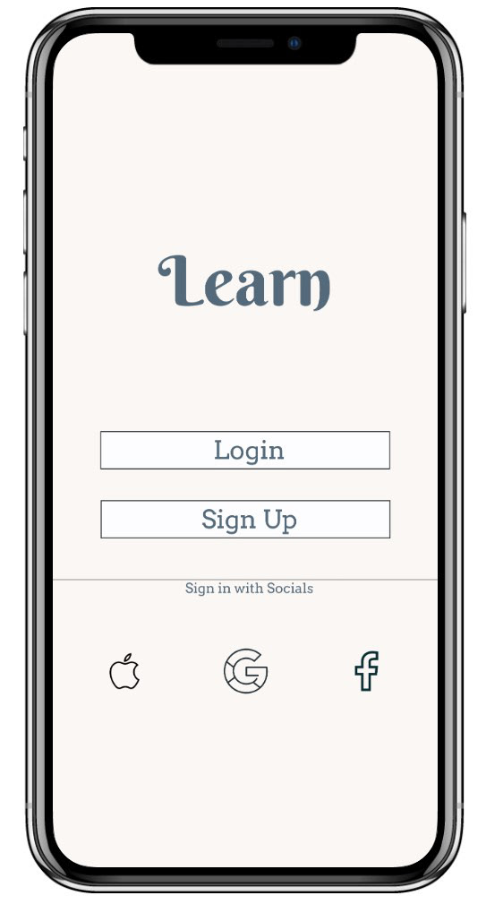
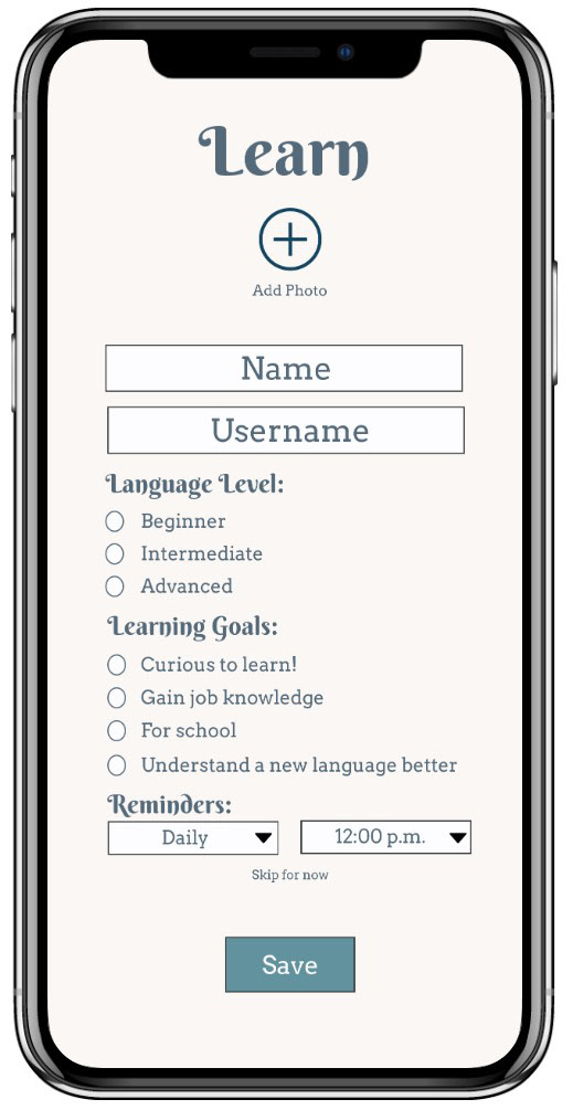
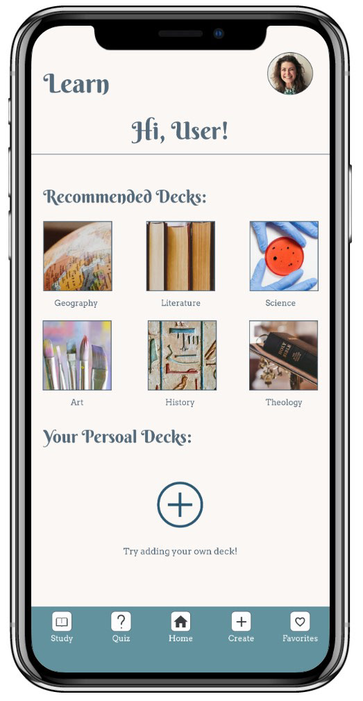
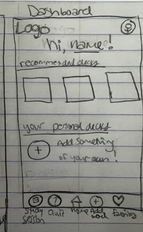
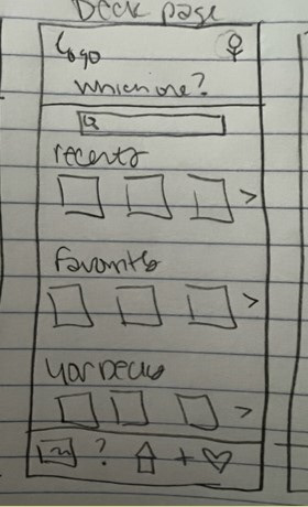
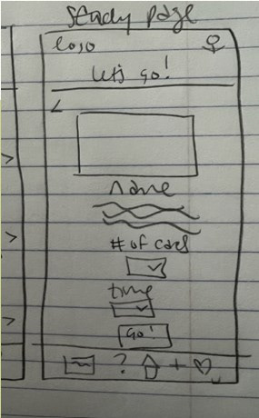
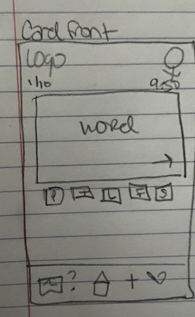
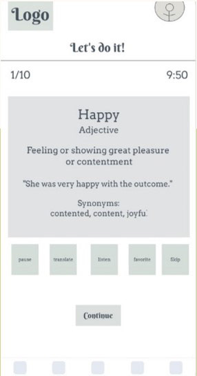
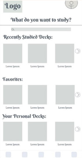
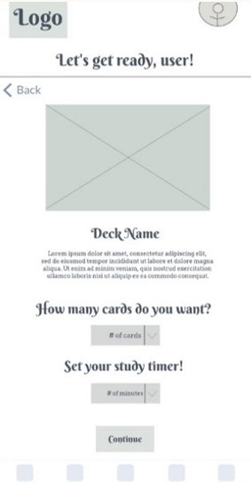
The process began with wireframes, with the features most important to Taylor kept at the front and center of the ideation process. Every wireframe showcases Learn's most valuable feature: its ease. The person studying is in full control of how they study and their time. I think these wireframes do a really good job of showing the customizations that can be made in Learn. Not everyone learns the same way. Taylor and I learn differently, so why should we both use an app that only helps us in one way?
Mid Fidelity Prototype
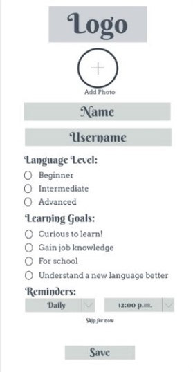
All the fine tuning and clarity came in the prototyping stage. Most of the designs stayed very close to their wireframe counterpart with some minor adjustments.
Usability Test
I kept telling myself this would be so easy and quick to use and so user friendly, but I needed to make sure that even in the prototype, users could see how much this app could do to help. I wanted to get as much information on each screen as I could to show how much Learn can do, but would that translate to users, or would it feel cramped? Users should be able to customize their learning experience, but would asking too many questions feel too intrusive? Would asking too few feel like the app couldn’t possibly live up to its promises? Are the options in the flashcards useful or does it feel like things are tossed in just to give the illusion that a lot can be done? I had a lot of questions I needed answered. To answer those questions, I conducted a usability test.
The Scope
Determine if the features in Learn are easy to understand and locate
The Schedule
June 13th and 14th 2023 over Zoom and FaceTime
The Equipment
Each participant was sent a link to the prototype. Interviews were recorded, and notes were taken
The Session
3 participants were interviewed. Each interview took approximately 10-15 minutes
The Metrics
The Jakob Nielsen error severity rating scale.
The Participants
Nick Terry, 26
Kinga Kielbasa, 25
Loree Griffin, 35
“I like that I can tell it where I am at personally. It makes the app feel like it is made for me.”
“On every page of the app, everything is available for you.”
“This is what a good app looks like.”
“The fact that the onboarding tells me about these features, and they ACTUALLY exist in the app is a win for me.”
“Icon images might make it even better and easier to see for everyone.”
Improvements
A lot of valuable information was learned from the User Testing phase. The feedback was implemented to make Learn even better.
-The “name” field in the user profile was removed to keep it feeling a little more anonymous. Only the username field remained
-The buttons became icons to help people identify them their options in a more accessible way
-Spacing issues in the prototype were fixed
-A second “password” entry space was added in the sign-up process so users can enter it twice when signing up to make sure there are no mistakes
Next Steps
Rework the Prototypes
-Make changes to the prototypes based on user recommendations
-Add in more screens to give the user a broader view of what the features can do
Test Round Two
-Conduct a second round of usability testing
-Consult the users who were part of the first usability test to get their updated feedback, and get new users involved
Get Final Feedback from Peers
-Get more feedback from peers on the high-fidelity prototypes to continue improving
